 previous
 home
home
Scatter plots
- You can draw scatter plots.
- The number allowed to draw the plots must not exceed 5.
- To start, click "Scatter Plots" button on the applet or select
"Scatter Plots" item from Tools in the menu bar.
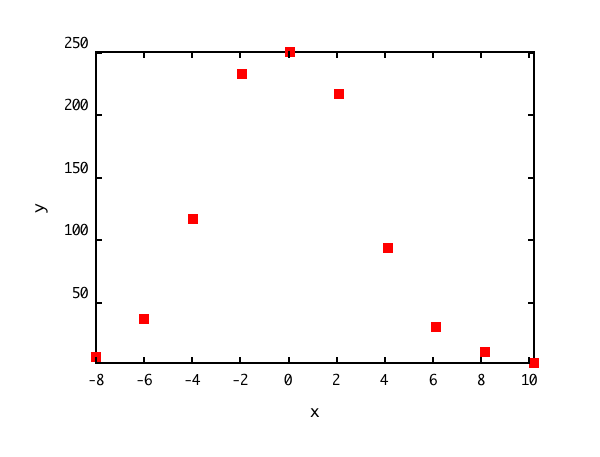
If you use the sample data,
click here, and save it in
the directory (or folder) specified in the user policy file.
When you draw the plot of the sample data,
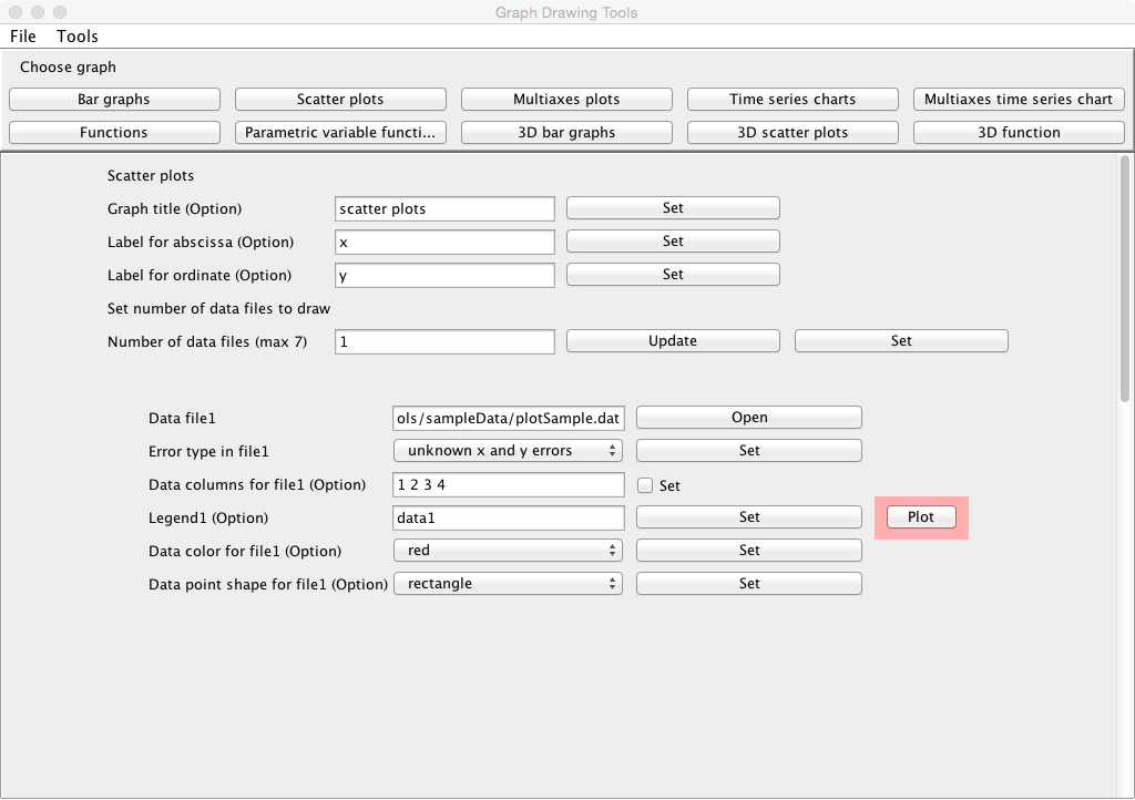
- Click the "Set" button at the line "Number of data files (max 5)".
- Click "open" at the line "Data file1", and specify the data file
name saved according to the above instruction.
- When clicking the "Plot" button bellow, the plot is displayed in another window.
Data
- Data must be inputted by normal width.
- Data must be inputted in the data file corresponding to the
following combinations of the errors of x data and y.
- When no errors are included in both x data and y, the data must be
inputted in order of x and y which are delimited by
space or tab. Change the line, and input the data of the following row
similarly until the input of the last data ends.
| x1 | y1 |
| x2 | y2 |
| . | . |
| . | . |
| . | . |
| xn | yn |
- When no errors are included in x data and the errors are included
in y, the data must be inputed in order of x, y and the
error of y (
 ) which are delimited by space or tab. Change the line, and input the data of the following row
similarly until the input of the last data ends.
) which are delimited by space or tab. Change the line, and input the data of the following row
similarly until the input of the last data ends.
| x1 | y1 |  |
| x2 | y2 |  |
| . | . | . |
| . | . | . |
| . | . | . |
| xn | yn |  |
- When errors are included in x data and no errors are included in
y, the data must be inputted in order of x, the error of
x (
 ) and y
which are delimited by space or tab. Change the line, and input the data of the following row
similarly until the input of the last data ends.
) and y
which are delimited by space or tab. Change the line, and input the data of the following row
similarly until the input of the last data ends.
| x1 |  | y1 |
| x2 |  | y2 |
| . | . | . |
| . | . | . |
| . | . | . |
| xn |  | yn |
- When errors are included in both x data and y,
the data must be inputted in order of x, the error of
x (), y and
the error of y () which are delimited by space or tab. Change the
line, and input the data of the following row similarly until the
input of the last data ends.
| x1 | | y1 | |
| x2 | | y2 | |
| . | . | . | . |
| . | . | . | . |
| . | . | . | . |
| x2 | | y2 | |
- In addition, you can use the table data form in the data file. You may
include the column data in the data file which are not necessary to make
the graph.
In that case, the specification of the columns in the data file used
to make the graph is needed at the line "Data columns for file1(2, 3, ...)(Option)" in the following "Input" instruction.
Data files
- The title for the graph can be specified at the line "Graph title (Option)". Click the "Set" button after describing it.
- The label for the abscissa in the graph can be specified
at the line "Label for abscissa (Option)". Click the "Set" button after describing it.
- The label for the ordinate in the graph can be specified
at the line "Label for ordinate (Option)". Click the "Set" button after describing it.
- Input the number of data files to be drawn at the line "Number
of data files (max 5)", and click the "Update" button. The number of
data files must not exceed 5.
- After that, click the "Set" button.
Inputs
- Click "open" at the line "Data file1" and specify the data file name.
- Select the error type of the data set at the line "Error type in file1"
according to the combinations of the errors of x data and y.
- When no errors are included in both x and y, select "unknown x
and y errors", and click the "Set" button.
- When no errors are included in x and the errors are included
in y,
select "y errors only", and click "Set" button.
- When errors are included in x and no errors are included in y,
select "x errors only", and click "Set" button.
- When errors are included in both x and y, select "x and y
errors", and click the "Set" button.
- The columns in the data file to be used to draw a graph can be
specified at the line "Data columns for file1 (Option)".
- When "unknown x and y errors" is selected at the line "Error type
in file1", the columns must be specified in order of the column of x data and the column of y data which are delimited by space. For instance, when x data are put in the third column and y data in the fifth column in the data file, specify "3 5", and check the "Set" box.
- When "y errors only" is selected at the line "Error type in file1", the columns must be
specified in order of the column of x data, the column of y
data and the column of the errors of y which are delimited by space. For instance, when x data are put in the third column, y data
in the fifth column and the errors of y in the sixth column in the data file, specify "3 5 6", and check the "Set" box.
- When "x errors only" is selected at the line "Error type in file1", the columns must be
specified in order of the column of x data, the column of the errors of x
and the column of y data which are
delimited by space. For
instance, when x data are put in the third column, the errors of x
in the forth column and y data in the fifth column in the data file, specify "3 4 5", and check the "Set" box.
- When "x and y errors" is selected at the line "Error type in file1", the columns must be
specified in order of the column of x data, the column of the errors of x, the column of y data and the column of the errors of y which are
delimited by space. For
instance, when x data are put in the third column, the error of x
in the forth column, y data in the fifth column and the error of y
in the sixth column in the data file, specify "3 4 5 6", and check the "Set" box.
- The explanatory note (legend) for the graph can be specified at the
line "Legend1 (Option)". Click the "Set" button after describing it.
- The color of the graph can be selected at the
line "Data color for file1 (Option)". Click the "Set" button after
selecting it.
- The marker type can be selected at the
line "Data point shape for file1 (Option)". Click the "Set" button after
selecting it.
- Input similarly for the number of data files specified.
Outputs
- When the "Draw" button is clicked, the graph is displayed in
another window.
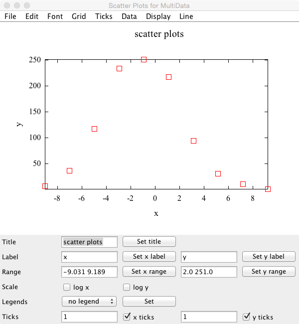
Graph window
- You can change the title for the graph at the line "Title". When a
suitable title is inputted, and the "Set title" button is clicked, the title is changed.
- You can change the labels of x and y axis at the line "Label". When a
suitable label is inputted respectively, and the "Set x label" button
and the "Set y label" button are clicked, the labels are changed.
- You can change the display ranges of x and y axis at the line
"Range". When a suitable range is inputted respectively (the
numerical values must be delimited by space), and the "Set x range" button
and the "Set y range" button are clicked, the graph that the display
range has been changed is displayed again.
- You can change the scales of x and y axis from the linear to the log scale at the
line "Scale". When changing it to the log scale, check each check
box. When releasing it, remove the check from the box.
- Explanatory notes (legends) can be displayed at the position
specified. At the line "Legends", specify the position at which the explanatory notes are displayed, and click the "Set" button.
- Ticks can be put in x and y axis at the line "Ticks". Tick can be put
by inputting a suitable tick value (1 to 10) and clicking the "x ticks" button or the "y ticks" button.
- To save a graph image, refer here.
Kazushi Neichi
Department of Business Administration, Tohoku Gakuin University