 previous
 home
home
Function plots
- You can draw plots of functions.
- The number allowed to draw the plots must not exceed 5.
- To start, click "Functions" button on the applet or select
"Functions" item from Tools in the menu bar.
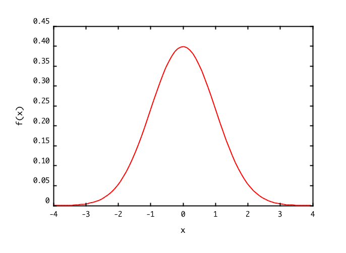
When you draw the sample graph,
- Click the "Set" button at the line "Number of functions (max 5)".
- When clicking the "Draw" button bellow, the graph is displayed in another window.
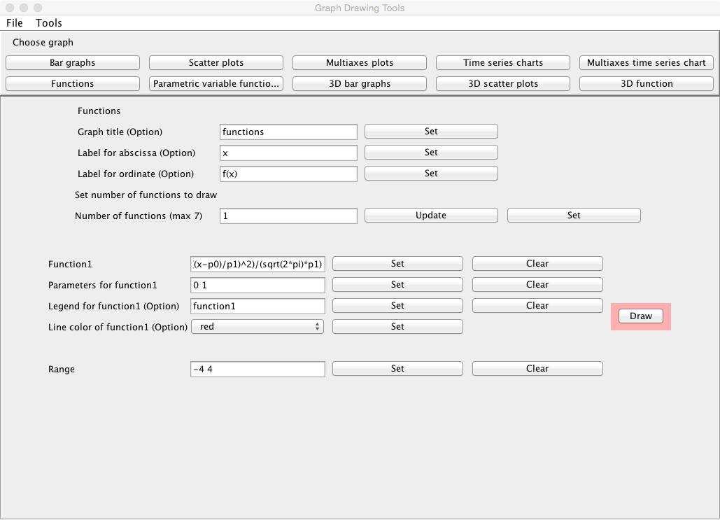
Setting a number of functions
- The title for the graph can be specified at the line "Graph title (Option)". Click the "Set" button after describing it.
- The label for the abscissa in the graph can be specified
at the line "Label for abscissa (Option)". Click the "Set" button after describing it.
- The label for the ordinate in the graph can be specified
at the line "Label for ordinate (Option)". Click the "Set" button after describing it.
- Input a number of functions to be drawn at the line "Number
of functions (max 5)", and click the "Update" button. The number of
functions must not exceed 5.
- After that, click the "Set" button.
Inputs
- Input the function to be drawn at the line "Function1", and click
the "Set" button.
- If parameters are included in the function, input the values of
the parameters which must be delimited in space at the line "Parameters for function1", and click the "Set" button.
- The explanatory note (legend) for the function can be specified at the
line "Legend for function1 (Option)". Click the "Set" button after describing it.
- The color of the line of the function can be selected at the
line "Line color of function1 (Option)". Click the "Set" button after
selecting it.
- Input similarly for the number of functions specified.
- Specify the range for x at the line "Range" which the values must be delimited in space, and check the "Set" box. For instance,
when you want to assume the range of x to be 0
 x 15,
specify "0 15", and check the "Set" box.
x 15,
specify "0 15", and check the "Set" box.
Outputs
- When the "Draw" button is clicked, the graph is displayed in
another window.
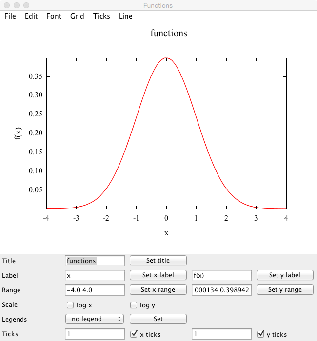
Graph window
- You can change the title for the graph at the line "Title". When a
suitable title is inputted, and the "Set title" button is clicked, the title is changed.
- You can change the labels of x and y axis at the line "Label". When a
suitable label is inputted respectively, and the "Set x label" button
and the "Set y label" button are clicked, the labels are changed.
- You can change the display ranges of x and y axis at the line
"Range". When a suitable range is inputted respectively (the
numerical values must be delimited in space), and the "Set x range" button
and the "Set y range" button are clicked, the graph that the display
range has been changed is displayed again.
- You can change the scales of x and y axis from the linear to the log scale at the
line "Scale". When changing it to the log scale, check each check
box. When releasing it, remove the check from the box.
- Explanatory notes (legends) can be displayed at the position
specified. At the line "Legends", specify the position at which the explanatory notes are displayed, and click the "Set" button.
- Ticks can be put in x and y axis at the line "Ticks". Tick can be put
by inputting a suitable tick value (1 to 10) and clicking the "x ticks" button or the "y ticks" button.
- To save a graph image, refer here.
Kazushi Neichi
Department of Business Administration, Tohoku Gakuin University